RUSSIAN JOURNAL OF EARTH SCIENCES, VOL. 18, ES3003, doi:10.2205/2018ES000623, 2018
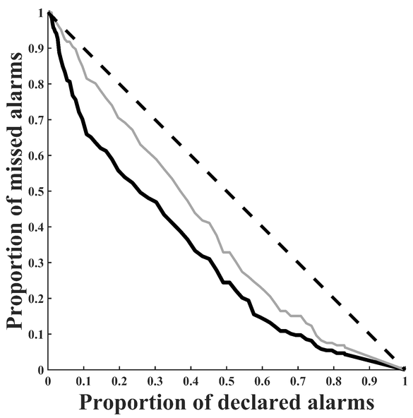
Figure 2. Error diagram for California. Thick dark line shows the relationship between the percentage of missed targets and the percentage of declared alarms for all earthquakes with $M \geq 5$ in the studied area, thin light line shows only major shocks with $M \geq 5$.

![]()
Citation: Dzeboev B. A., R. I. Krasnoperov (2018), On the monitoring of seismic activity using the algorithms of discrete mathematical analysis, Russ. J. Earth Sci., 18, ES3003, doi:10.2205/2018ES000623.
Copyright 2018 by the Geophysical Center RAS.
Generated from LaTeX source by ELXpaper, v.1.5 software package.